Most of us would have sat through PowerPoint presentations where the right mix of content delivery and attention-grabbing slides was not achieved. That is how one sees the death of potential proposal through powerpoint even before it takes a shape. This article focuses on tips and tricks to make your slides appealing and help you leave the desired impact to push your proposal.
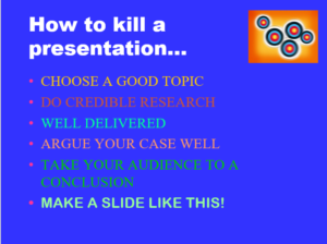
Figure 1: A poorly designed slide
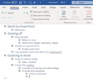
I’ve found that a good structure to the talk is the best way to convey point across. The outline view in Microsoft Word is designed to give an overview and is a good place to start. Outlining the presentation makes it easy to concentrate on the topic and content, without being waylaid by details like colour and animation. The entire outline can be ported to PowerPoint using the send to PowerPoint command.
Figure 2: Outline view of MS Word
Do make use of the layout view in PowerPoint to keep the slides consistent. A large variety of layouts are available to suit any need. Use a clean sans serif font which will be readable from a distance. Use sentence case and do not reduce the size of the font below 22 points.
Make your sentences brief and to the point. Ideally, everything should be bulleted and no bullet should span more than 2 lines. Use simple words to cue you and keep the audience engaged.
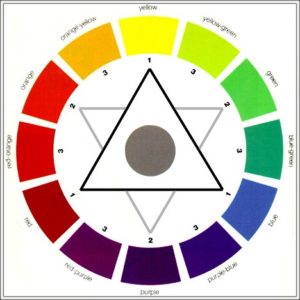
Be careful about colour. Remember that projectors do not reproduce colours faithfully so try to test the colours on an external display. Avoid using too many colours for fonts and keep it consistent through the presentation.

Figure 3: The colour wheel – Colours opposite to each other go better together
Use illustrations charts, graphics wherever feasible. Source your pictures carefully and make sure they’re of a good resolution. A graphic that breaks up into pixels on the screen or appears skewed reflects poor preparation.
Remember to omit any unnecessary details so that you can stick to the time. You should never have to stand in front of an audience and skip through slides. Plan it so that the presentation carries the right amount of detail for the right amount of time.
Learn to use the presenters view of PowerPoint to practice. This allows you to see the slide, your own notes and the time, on one simple screen. A number of shortcuts are available to jump from slide to slide, show a black or white screen, see headings of slides bracket open (Ctrl-S). So you can jump neatly from one slide to another.
| number+ENTER | Go to slide number |
| A or = | Show or hide arrow pointer |
| B or PERIOD | Display black screen / return to slide |
| W or COMMA | Display white screen / return to the slide |
| CTRL+P | Show pointer / Pen mode; E to erase |
| H | Go to the next hidden slide |
| CTRL+A; CTRL+H | Redisplay / hide hidden pointer |
| CTRL+M | Show / hide ink markup |
| CTRL+T | View task bar |
| CTRL+S | All Slides dialog box |
Figure 4: Some handy shortcuts while presenting
A good set of slides is important to keep the audience focused on the matter. Of course, the content and other skills matter as much. I hope the above points will help you make your presentation subtle yet powerful.


